Monday, 18 December 2017

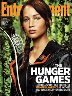
Analysis Of A Real Magazine: Entertainment Weekly

The masthead of the magazine is placed behind the key image which is quite conventional for a magazine. Due to the magazine being Entertainment Weekly they most likely already have an established group of people that never miss an issue so they will still be able to recognise the brand even if it’s somewhat covered. Moreover, even consumers which are not as familiar with the brand I believe that they are still able to work out the name of the magazine. The masthead is spread across the whole width of the magazine which reinforces its important. Furthermore, to make it stand out more the colour of the masthead is orange which adds a pop of colour and contrast nicely on the green background. The use of orange was planned out as it relates to some of the clothing and accessories the actress in the main image is wearing e.g. the sentimental mocking jay pin. Also it is used to highlight important text.
Above the masthead is the date of the magazine and the issue number. Due to it being written in white you can’t really see it which connotes that it may not be as important as other aspects of the cover.  The date displayed is May 27th. This reinforces the idea that the magazine is published weekly.
Underneath the masthead is a minor cover line. This is the smallest font size visible on the front cover (except for the date). The font of the cover line is sans-serif which makes it a bit easier to read. Furthermore the colour of the text is white which is effective as it stands out on the dark green background. The cover line just explains who the actress is for individuals who wouldn’t know as they may not be interested in this genre of film, also it states that the film ‘The Hunger Games’ is based on a trilogy of books which some people  may not be aware of.
The key image takes up most of the front cover. The key image consists of the main actress of the film featured: Jennifer Lawrence portrayed in the character that she plays Katniss Everdeen. The image is quite effective as she is facing forward resulting in making eye contact with the audience. This will draw in some individuals as they will become intrigued with the cover. Furthermore props like the bow and arrow and mocking jay pin are seen to be emphasized through looking a bit lighter than the image. These two aspects are probably the most recognisable features of the character so  that is why the magazine smarty emphasised these recognisable features.

In the bottom right corner is the main cover line of the magazine. The largest font visible is the title of the film featured ‘The Hunger Games’. The font is white which contrasts well with the black background of the characters clothing. Furthermore the text is very round which adds an element of fun and clearness. Right below there is a bold text stating ‘Exclusive!’ This is put in bold to emphasis the fact that what’s inside the magazine may be seen as limited to the reader. This will cause them to be more intrigued in the magazine and what’s inside. After that there is text explaining what the exclusive features are. The rest of the text is also in white but it is much thinner. This shows that it is less important than the exclusive tag however it is still considered as important information for the reader as the size of it reinforces that. Jennifer Lawrence’s name is emphasised s it is coloured in orange which link to the masthead and key image. 

Analysis Of A Real Magazine: Empire


The masthead is the largest font visible on the front cover. The typography of the masthead is very bold and visible this is due to two aspects; the font is sans-serif and thick which makes it easily visible. Furthermore the font is in red which may connote danger and it also relates to the key image of Daniel Radclyffe as Harry Potter with blood on his face. This is the only red font visible on the front cover.
The date and price of the magazine is displayed on top of one of the M in the masthead. The price for the magazine stands for £3.99 which shows that the magazine is more high-end and good quality. Also the date is ‘August 2008’ which connotes that the magazine is published monthly, this may also be a reason for the magazine to be a bit above the average price.
The tagline is situated right under the masthead and is presented in the same font and colour as the masthead. This allows continuity throughout the front cover. Moreover, the tagline states ‘The words biggest movie magazine’ which further emphasis how high-end it is. On the other side, below the masthead there is the website address for the magazines website. It is still in the same font and colour. It is important for consumers to notice that the magazine has a website as it may contain more exclusive information and interactive aspects. This may also mean that the magazine can be accessed online which may appeal to certain target audiences such as young film lovers aged 16-24. Lastly, this may also connote that the magazine uses social media which will even further their target audience.
The second largest font visible is the first teaser line ‘Massive preview special’. The typography is a sans-serif bold white font which contrasts the dark background and results in making it clear to read by the consumer. The teaser may also relate to the key image of Daniel Radclyffe as it may relate to a new Harry Potter movie coming out. This will intrigue the audience as they will want to see a preview of the new movie especially of they are already a big fan. Right below that there is a teaser stating ‘45 new movies you need to know about right now’. The use of this words such as ‘need’ and ‘right now’  emphasise to the reader that they need to pick up the magazine otherwise they will miss out. The font of the text is bold and still quite visible due to the colour of it being yellow.
 The overall colour scheme of the magazine seems to be yellow white and red, which nicely contrast with a blue background. Due to not many different colour and style fonts being used the front cover looks clean and easy for the reader to navigate through.
The key image is of Daniel Radclyffe portraying himself as Harry Potter. The photograph of the actor is a medium shot which allows the audience to see his whole facial expression. Due to the actor looking straight into the audience eyes it will cause them to be more likely to notice the magazine due to the eye contact. The image allows the text around to be distributed on the left side of the front cover and still make it easy to see due to a plain background.

There is a barcode in the bottom left of the cover. This is a typical convention of any magazine and connotes professionalism and that the magazine is not free.

Analysis Of A Real Magazine: Total Film

The skyline of the magazine consists of text ‘10 coolest movies being made right now’ and right next to it there are 3 photos of movies with their names attached. The use of words ‘right now’ cause the audience to be intrigued in the movies listed and will want to read the magazine due to this.
The masthead is the largest title visible on the front cover, also, its positioning at the top of the cover is a convention of how magazines are laid out. It is overlapping with the main image character in order to put more emphasis on the focus of the cover which is the film, moreover, it is still recognisable and visible. The biggest font is ‘Film’ as it is presented in a white colour which contrast the blue background. The typography is san-serif and bold. This allows it to be easily recognisable to the audience. The ‘Total’ is engraved in the ‘F’ of the ‘Film’ which adds a stylistic element to the front cover, furthermore, this is a running theme throughout most issues of the magazine.

Below the masthead is the date of the magazine ‘September 2009’. This shows us that the magazine gets published monthly which explains the above average price of £3.99.
The key image presented in this issue is a medium shot of a well-known actor Robert Downey Jr who plays the lead character of Sherlock Holmes in the new upcoming film. The actor is positioned in the centre and looking straight at the audience which may cause them to notice the magazine more due to formed eye contact. The way he is dressed is quite informal and that is further emphasised by him having his hands in his pockets. His outfit ranges from different shades of blue which carry on the colour scheme of the issue. By portraying the main character on the front cover the magazine will maximise sales as even people that may not be aware of the new Sherlock Holmes movie coming out they will recognise the actor and due to this may be interested in the magazine. On top of the lower half of the image there is text relating to the main image. The largest text is ‘Sherlock Homes’ as that is the character portrayed. It is written in a serif font. The word ‘Sherlock’ is written in the colour white and in a thinner font compared to the word ‘Holmes’ which is written in a much thicker and blue font. This makes the cover a bit more interesting and may aide in catching the audience’s attention. Above the character’s name there is a pull quote from the article inside. This gives the audience a sneak peek in to what they can expect to see inside and therefore cause them to be more intrigued.
All the teaser titles are in a blue which matches the background colour offering continuity. The font of the teaser titles is sans-serif and quite thin, which nicely contrasts with the text below which is in black and is a bit thicker. The teaser allocation on the front cover allows empty spaces to be filled out while still making the magazine look clean.
In the bottom right corner there is a barcode which connotes the professionalism of the magazine and that it is not for free.


Editorial Day

     Today, we had an editor come in to help us with our trailer; this is what he said: 
     Speed up shots - The initial trailer had various daytime shots that took 30 seconds. This was bad because we had established day-time in the first 5 seconds, so the trailer was extended and there was no tension. Consequently, the first half of the trailer was boring and uneventful. The second half of the trailer featured camping at night. The shots were much shorter and more frequent, which helped build tension and established that it was a horror trailer. We will therefore include shorter shots with razor cut transitions, and remove most of the day-time shots.


·     Add horror element – The trailer has several running scenes showing that people are being chased. Tension is built however it was lacking actual horror as there was no murderer/evil entity but constant scenes of fleeing. The editor told us that this would be ineffective as there was no release to the tension, and the scenes were repetitive. This could be achieved through a shot of a knife and a man in a mask.

·     Build tension and end with horror - The tension can be released by showing that someone has been killed/kidnapped. Through researching other hand-held horror trailers, I can see that music built up to a crescendo and often a lantern or camera would be dropped, which shows that something bad had happened. 
·     Car moving scene - The car moving scene establishes day-time and equilibrium. In our current trailer, the car scene is extremely long and boring. We will cut down this scene to show people waving, bags being packed and then the car moving away. This should take 5 seconds and keep the introduction interesting.
      A time-lapse will be added to show the transition from day to night.
      Overall the editorial day taught us to use time much more effectively by having quick shots which makes the trailer fast-paced, adding to the conventional horror theme. 

Specific Planning


We created consent forms in order to not deal with any ethical issues. Furthermore, not all the cast was 18 yet so we had to ask for parent/guardian permission.

Update: New Shooting Script

                                             
Shot name
Shot Type
Camera Angle
Camera Movement
Sound
Action
Purpose of shot
Shot Length
(s)
1
Graphic
-
Pan
Music
The name of production with blood splatter
This shot will tell the audience of the production that created the movie
6
2
Longshot
Low
Pan and Fade
Music
Logo for Bedfont lakes country park
This is to set the scene and tell the audience where they are going
2
3
Longshot
Straight
Pan and Fade
Music
A lake within Bedfont lakes  country park
This also helps set the scene and the lake shows a sense of depth and size of the park
3
4
Close-up
High angle
Zoom and Fade
Music
Zoom into a branch and go out of focus
This is also to established the scene with bright colours and show a happy setting
2
5
Graphic
-
-
Music
“Based On A Story”
Telling the audience that it’s found footage
2
6
Midshot
High angle
Tracking
Music
The group are walking across a small wooden bridge
This is set the scene and to show their progression towards the tent setup
3
7
Handheld
Close-Up
Fade
Music
Talking into the camcorder like a video log
This is to reinforce this style of found footage with a camcorder
3
8
Graphic
-
-
Music
“What Was Meant To Be An Adventure”
This indicates where everything changes and goes bad
2
9
Midshot
Static
Fade
Music
The group are setting up the tent
The group are shown to setup the tent from a camcorder which to show progression from the first few scenes
3
10
Extreme Close-Up – Midshot
Eye level
Zoom out
Music
Close up on Aisha whilst setting up the tent
This makes the audience feel happy which is done to contrast later on
2
11
Graphic
-
-
Music
“Turned Into”
Add to the suspense
2
12
Close-Up
Eye Level
Pan
Music
Sign with text “NO ENTRY AFTER NIGHT FALL”
This is to indicate they are not supposed to be there and something is or is going to go wrong
2
13
Time lapse
High angle
Still
Soundtrack – wind
Transition from day to night
This transitions from day to night
2
14
Graphic
-
-
Music
“Evil”
This is the point where it goes bad
1
15
Longshot
Eye level
Still
Music
Long shot of Hamza wearing mask
Sequence of shots to add to the suspense of the mask creeping in slowly
1
16
Handheld
Close-up
Shaking slightly
Music
Close-up on Rahul’s face lit up by a torch
Night vision shot makes the atmosphere very tense
1
17
Longshot
Eye level
Still
Music
Long shot of Hamza wearing mask
Sequence of shots to add to the suspense of the mask creeping in slowly
.5
18
Graphic
-
-
Music
“SOMETHING”
To tell the audience someone’s following the group
1
19
Close-Up
Eye level
Still
Music
Close-Up shot of Hamza wearing mask moving forward
Sequence of shots to add to the suspense of the mask creeping in slowly
1
20
Longshot
Eye level
Still
Music
Climbing fence
Sequence of shots to add to the suspense of the mask creeping in slowly
0.5
21
Close-Up
High angle
Still
Music
Close-Up on my face night vision
0.5
22
Longshot
Eye level
Still
Music
Climbing fence
0.5
23
Close-Up
High angle
Still
Music
Close-Up on my face night vision
0.5
24
Longshot
Eye level
Still
Music
Climbing fence
0.5
25
Close-Up
High angle
Still
Music
Close-Up on my face night vision
0.5
26
Longshot
Eye level
Still
Music
Climbing fence
0.5
27
Close-Up
High angle
Still
Music
Close-Up on my face night vision
0.5
28
Midshot
Low angle
Tracking
Music
Walking towards the lantern and picking it up
This shot is to add to the tension with a sharp contrast in lighting
3
29
Midshot
Low angle
Walking forward
Music
Walking with the lantern
This shot also builds up to the suspense
1
30
Graphic
-
-
Music
“IS OUT THERE”
Tell the audience that someone’s out there after the group
2
31
Midshot
Eye level
Still
Music
Olivia gets grabbed from behind whilst looking into the camera
This is used to show that there is a threat on the group but doesn’t reveal too much
2

32
Graphic
-
-
Music
“Insane” – title of the movie
This to tell the audience the title of the movie
3

33
Graphic
-
-
Music
“COMING SOON
#ITSWATCHING”
To tell the audience when the movie is coming out and its hashtag for twitter to gain hype
1
34
Close-Up
Eyelevel
Shaking
Music
Hamza wearing mask jumps up from underneath
This is a jumps scare to surprise the audience
1
35
Graphic
-
-
Music
Credits
The credits are to tell the audience who was in the movie and made it possible
3


We have created a new shooting script as we changed some shots around and decided to change the order. The new shooting script allowed us to be confident in the shot sequence and music that goes with them. Also, we will be able to create the actually  trailer in a organised and efficient way as everything is planned.                                                                                                                                                                                   

New Magazine

After much consideration and feedback I decided to alter my magazine front cover. I mostly focused on re-doing the left hand side wh...